I would like to suggest to move both of them back to the position as in 1.6. I always have been used (at least I think so…) to find the most obvious buttons for the next step in the upper left corner.
Btw, this was solved perfectly in V2 for the “save” button in the edit view of rules, thanks
There are different views to this design decisions. Yes the Save on top is very good i also think this is a big improvement.
The changes on the top right i find now after some migrations to 2.0 also very good as there is no problem as before that you miss that there are open changes. The changes where in 1.6 only visible if you are inside WATO and also there not in all places. Now i also see in the normal host or service view left top yellow circle → open changes.
But as said there are different views for the same problem.
Hi,
the “changes” button on the top right in v2 I also find better implemented, I had to get used to it though .
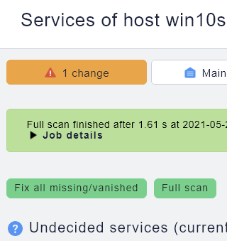
But I would like the “fix all” button to be placed under the menu bar and not in the middle of the page.
I agree that the new placement is an improvement, but I wish it was more prominent. It’s easy to miss it. More than once, I’ve spent a few minutes chasing an odd issue I thought I fixed only to finally notice that I hadn’t applied pending changes.
Hi,
Thanks for your feedback. The service discovery page UI is under rework at the moment and the “Fix all” button is likely to move top left as suggested.
The current implementation had a few issues:
Style like a state (e.g. OK, solid color) not like a button (e.g. position, icon, light color)
Position, used nowhere else in the UI
May I ask a few questions:
Is the scan results section of any use for you?
How important is the time needed for the scan
Do you want to see the labels at the top, or should the services come first
Looking forward to your answers
Currently, we have no plans to change the “changes” button top right. But i will have a look, if it can become more visible
Only for troubleshooting. If you have a device with normal behavior then it is not needed.
Suggestion → if there is an error internal at scan time - automatically show the scan result. Leave it closed if you have no error condition.
It depends
I personally would leave it there at the top. It would be strange to have such information at the bottom → bottom = less important
I have one other strange behavior from time to time. You press the “Fix all” and it looks like the system does something but everything stays the same. After a second press of “Fix all” the system works and does the “Fix all” really.
I join the answer of Andreas in all three points.
The time spent for a scan and the scan details should not be placed too prominently, but it is worthful information. Good to have them still available somewhere on the page.
Labels on top: yes, definitely.