I have graphs enabled to output on the email alert of the service and have to say it looks great! (kudos to the team for making a sleek interface/format from 1.6.x to 2.0.x)
A question came up for one of the departments i’m providing monitoring for regarding the graphs that display currently in what appears to be a 48 hour format. (see pic below)
Is there any way to modify the time value of the graph being displayed to break down this better (I would say maybe a 4 hour timeframe) so that the end user could see in minutes when the outages occur?
For the notifications graphs there is only 25 hours time frame used if not modified.
Your example only shows 25 hours
If you want to change this, you need to modify the function that generates the graphs inside CMK.
→ ~/lib/check_mk/gui/plugins/metrics/graph_images.py
function name → _answer_graph_image_request
Thank you Andreas as always for the helpful direction, I was looking for that function name and couldn’t find where that function lives within the graph_images.py file.
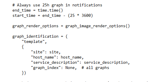
I do see this:
Wondering if I change the 25 in this line to 4 if that would change the graph to the desired 4 hour output.
Line Reference:
Original config
start_time = end_time - (25 * 3600)
This topic was automatically closed 365 days after the last reply. New replies are no longer allowed. Contact an admin if you think this should be re-opened.