r.sander
(Robert Sander)
1
Hi,
after the last update of the forum software the color scheme seems to have changed.
I find it hard to distinguish between read and unread messages in the “profile menu” in the upper right corner. Could the contrast be adjusted?
On https://forum.checkmk.com/u/username/notifications it is the same.
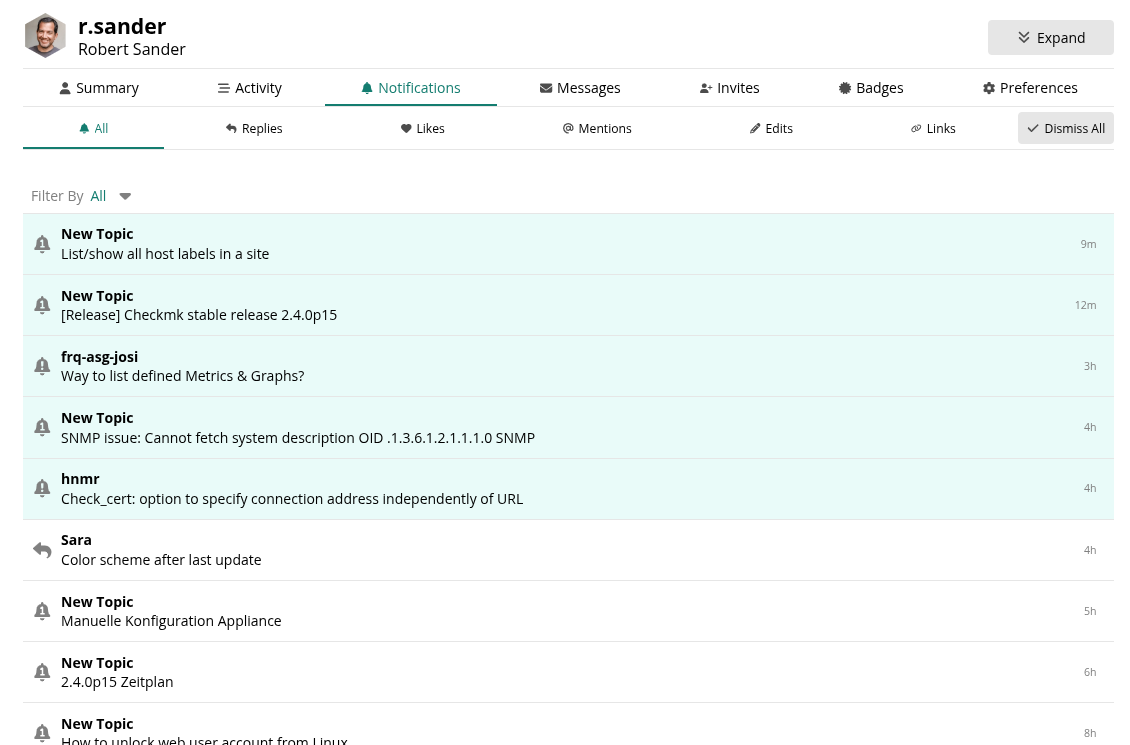
Sara
2
Hi Robert!
Do you mean the slight yellowish background of the line (in light scheme)?
r.sander
(Robert Sander)
3
I mean the contrast between read and unread like between your answer and the post of “hnmr” in the attached screenshot.
AFAICR this was better visible in the old version.
Sara
4
Got it. Let me check with the team.
I am not completely sure what it looked like before but we can try to improve what we have now.
Sara
5
@r.sander we made some changes. What do you think?
r.sander
(Robert Sander)
6
It’s a little bit more contrast now. IMHO it’s acceptable.
1 Like