Hello Team, I am using CheckMK Ultimate 2.5.0p7. I have created a custom dashboard for specific users, filtering the relevant widgets by specific hosts and services using labels. This worked for widgets in the “Host & site overview” and “View” categories. However, for widgets in the “Metrics & graphs” category, the graph is generated and displayed but remains empty—meaning no line or curve appears within the graph. What could be the problem? What can I change?
Hi.
Did you set the restrictions on Dashboards for single hosts? I thing the filter with label will not work or metrics.
RG, Christian
Hi Christian - yes → Widget filters → Host Label. But if that doesn’t work, how can I filter for the specific hosts/services?
Hi,
Christian is right. The available visualization widgets depend on the data you have selected.
Single Graph, Single Metric, and Gauge widgets are only available when a single host is selected, while Barplot, Scatterplot, and Top List support multiple hosts.
Could you share a screenshot of your widget configuration? That would help to support you.
Best
Mathieu
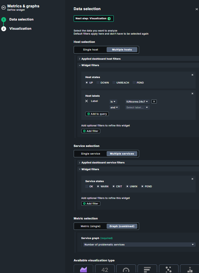
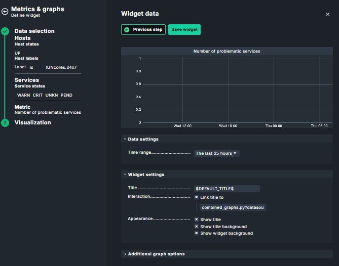
Hi,
I believe the graph is empty due to a configuration issue. To the best of my knowledge, the Number of problematic services graph is a built-in graph of the Site Statistics service.
Looking at your screenshot, I noticed 2 potential issues:
- You are filtering on multiple hosts – I believe filtering on the site itself should be sufficient in this case.
- You are applying a service state filter to the widget and excluding the “OK” state. This means that if your Site Statistics service is currently in an OK state, it will be filtered out, and the associated graph will not have any data to display.
I hope it helps.
Best
Mathieu
Hi,
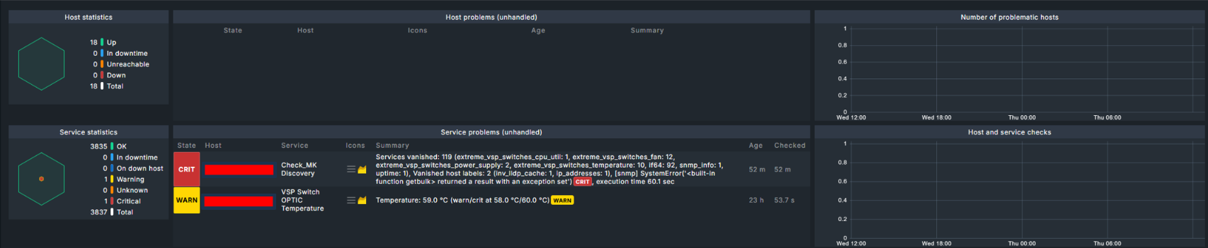
Point 2: I definitely have one ‘warning’ and one ‘critical’ service – this should be visible in the graph.
Point 1: Let me explain what I need for this dashboard: I am monitoring around 200 hosts. Of these, 18 are critical for the on-call team. The team needs a dashboard that displays these 18 hosts and services along with their associated alerts. This works well using widgets from the “Host & site overview” and “View” categories. As an additional view, I would like a history graph showing the total number of past and current alerts. This would assist the on-call team during shift changes; for instance, a team member coming on duty could see that there was a high volume of alerts the previous day and take appropriate action.
Knowing that there were many alerts yesterday can be genuinely helpful for the on-call team.
That is why I would like to have this graph.
regards
Falk
For your use-case, the Number of problematic services graph won’t give you the result you are looking for. It aggregates the service problems for all hosts of a site, meaning that filtering won’t work since the service belongs to a single host which is the site host.
I would recomment to use the Alert timeline widget instead, as it tracks alerts over time as shown in the screenshot below.
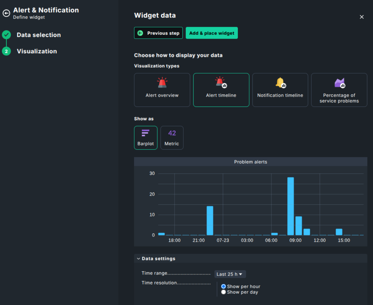
Best,
Mathieu
Hi Mathieu – that’s it! That helps me – it’s exactly what I want. It’s even better, actually, because you can click on the graph bars and get an overview of the service alerts—even for past events.
Thank you so much!
Regards
Falk
1 Like