CMK version: Checkmk Raw Edition 2.4.0p15 OS version: CentOS7
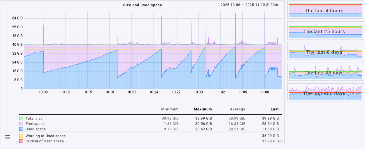
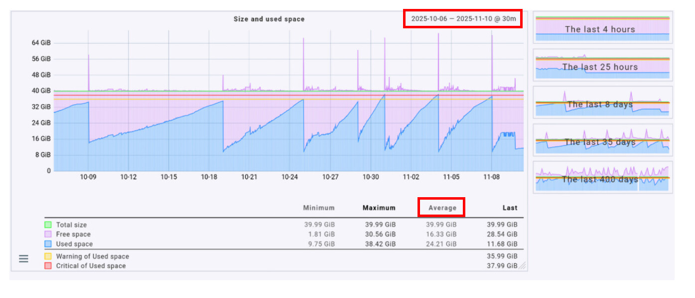
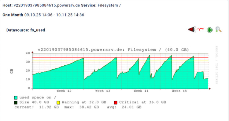
the VM uses a 40GiB (43GB) vHDD, but the graph exceeds the 100% at serval points. this sometimes changes depending on zoom level, but the overall graphs at the right side are always wrong.
Check_MK OS is GNU/Linux Debian12, the VM monitored still uses CentOS7 (check_mk agent 2.0.0p2) I’ll try to update the agent… but, if Check_MK encounters unsupported agents, it should report so otherwise I consider it as a bug.
This happens because the lowest or highest values from different metrics within the 30-minute time range are combined. As a result, the total does not reflect the value that would be obtained if all metrics from the same point in time were added together. If you switch the graph to “Average,” the numbers should be roughly correct (klick on “Average” in the graph).
the change to Average indeed changes the graph, but it’s a bug anyways, because all values in the column Maximum never exceed 40G.
the filesystem has a hard upper limit of 40G .. none of used,free,unused,whatsoever can ever exceed 40G …… btw. what’s the use of free as opposed to unused? unused space is always free?!
all fs metrics in sum can never exceed 40G in this case.
The aggregation takes the lowest or highest value from the given time range and then calculates the total, since this value is not stored in the RRD (don’t ask me why it isn’t).
For example, if at 09:04 the maximum free space was 25.67 GiB and at 09:23 the maximum used space was 19.39 GiB, the result for this time period would be:
Free space: 25.67 GiB (= maximum from 09:04) Used space: 19.39 GiB (= maximum from 09:23) Total size: 45.06 GiB ( = 25.67 + 19.39, from different timestamps)
It should be noted that the RRD already performs an internal aggregation of values, depending on your RRD configuration. Depending on the graph resolution, the graph may also need to aggregate these values again.
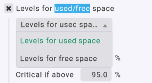
Since it’s possible to define thresholds for used and free, both metrics are required.
Hi @LaSoe thanks for your explanation, still I don’t see any usefull usage of free and unused in one graph. especially if “your mathamatics” then exceed 100%
I can indeed configure different thresholds for used and free, but not unused.
I assumed the maximum,minimum columns where only for informational purposes. still, regardless of how metrics are stored within RRD files .. there is just no way of having any metrics or % numbers exceed 40G or 100% in any case. a graph that changes itself that way depending on 1min or 5min timeframe is pointless to me, sorry to say that.
maybe you can find an explanation about free vs. unused. I couldn’t!
even when using average values (rounded to some longer/shorter interval whereas the real rrd metrics where gathered at a different sample rate), the filesystem is never greater than 40GiB (100%), not even when showing minima or maxima. if you add % values based on a different 100% basis, than this calculation is at least useless if not wrong.
RRDtool uses the configured RRA settings from the rules “Configuration of RRD databases of services/host”. Inside the rule this part is important for the problem with the graphs.
At consolidation time rrdtools saves only the checked values for a time range.
As the first consolidation step takes place after 48 hours, your problem with Min/Max/Average can happen already with two days old data.
This and the consolidation done by the graphing frontend lead to your spikes.
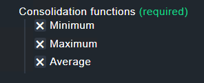
Generally you can say for every check that has multiple value that add together to a static value you need to use “Average” for the graphing of this values.
And to make things even more confusing, RRD always processes data in fixed one-minute intervals. For example, if two values are received at 09:11:22 and 09:12:23, RRD will interpolate the value for 09:11:00. This can sometimes result in confusing metrics, such as a graph showing a process count of 0.89 .
As stated in the official documentation:
“When monitoring the state of a system … you may not always be able to fetch data at exactly the time you want. Therefore RRDtool lets you update the log file at any time you want. It will automatically interpolate the value of the data‑source (DS) at the latest official time‑slot (interval) and write this interpolated value to the log.” (oss.oetiker.ch)
From a technical perspective, this behavior is entirely correct, even if it may not always seem logical or intuitive to users.
It doesn’t really get any better, but once you understand it, you get a little less frustrated about it.
It can be changed, as these old graphs shown are pnp4nagios graphs, you can define templates how the data is shown.
Also this graph shows a single value and not a combination of two, the result will be as shown without over 100% as this is not possible with a single value.
as you can see, the graphs never exceed 100% of the filesystem size, which is 40GiB here.
so, the messurement values in the RRD files are correct.
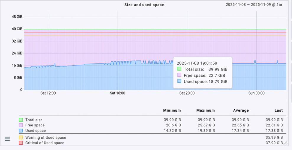
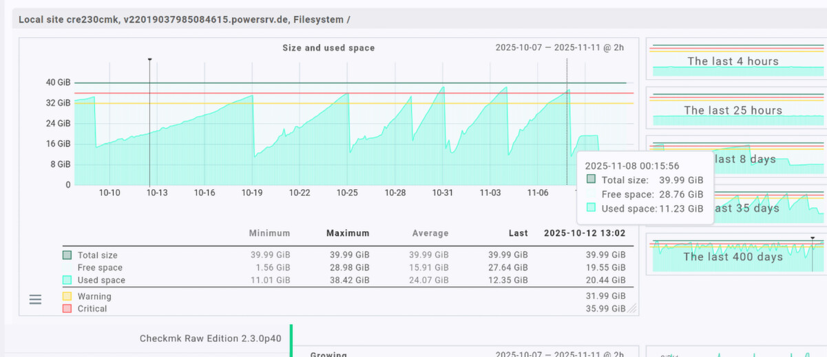
what still is wrong are the numbers. free space is 28.76 but the mouse pointer still is over the cyan? used size. but it’s ok, as long as the email alerts were correctly sent.
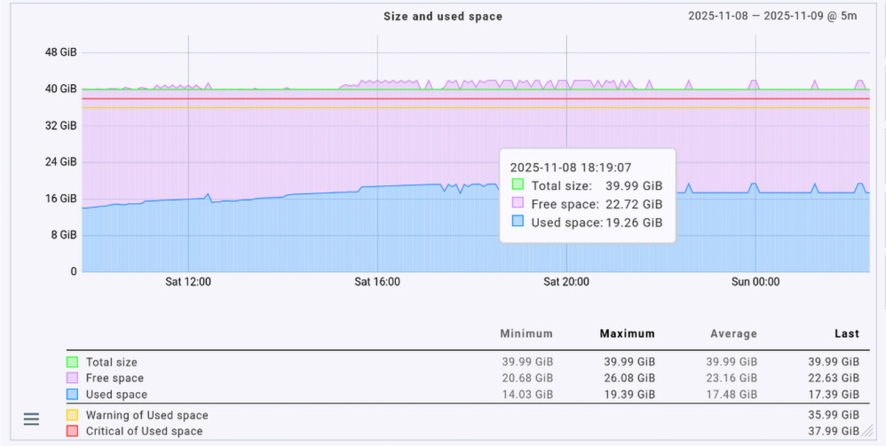
in my screenshots above from cmk 2.4.0cre there is free 22.72 and used 19.26 which sums up to 41.98 (wrong by 2G above 100% fs size)
same with free 22.7 + 18.79 used = 41.49 GiB (wrong too)
I don’t wonna argue about math, but there is a simple proven concept regarding % calculation for fixed sized things: you calculate 100 minus everying else. it doesn’t matter if you subtract one value or 2 or 3!! this way the result never exceeds 100% and all parts can by easilly sumed up back to 100% .. withouth even the smallest rounding error!
imagine the fuel gauge of your car shows 15% over F = 115% fuel loaded
I understand your point, and I’m totally with you. You don’t need to argue with me about that. The same issue also exists with the memory graph.
All I can do is to explain why Checkmk seems to show it “wrong.” It’s not a math problem; it’s about how data aggregation works and which values Checkmk actually uses to generate the graph.
In your example, you are mixing max and average values. Checkmk, on the other hand, always uses the same aggregation type (min/max/avg) for all metrics, which leads to these awkward and sometimes confusing displays. Do I like it? Absolutely not.
If you want anything to change, you’ll have to convince Checkmk, not us .
You can either open a bug ticket or submit it on the ideas portal and good luck with that.
it’s not my example. I did not programm CMK. I showed, that CMK 2.3.0 does it right, as all CMK versions did before.
(I use CMK for over 20years now)
this is a CMK forum, right? so chances are greater 0 that the DEVs are reading here too.
based on my life expierence it’s close to impossible to change such things with a bug report, because people always need to be convinced first, like you. they don’t see the obvios, even if I provide undeniable facts by using CMK 2.3.0 and 1.6.0 and the same RRD files out of my private CMK 2.4.0p15raw
hopefully the other enterprise CMK versions do not have this bug, as we use CMK for our customers too. it is very disappointing to read, all “your” posts complaining about what I did wrong or what all users have to accept as correct .. although all CMK versions excluding 2.4.0 are able to draw correct graphs out of the same RRD files which were filled for years. now, 2.4.0cre generate graphs that exceed 100% and nobody seems to be able to think what causes this difference. it seems to be easer to argue that the earth is flat as to try to understand what the software does differently now.
as for me, I really liked the oldschool pnp4nagios graphs, as they were fast generated and still able to be zoomed in. besides the fact, that were correct and easy to read. I really don’t unterstand why DEVs always change features worked for decades in a real world scenario .. just to make GUIs more fancy, wobeling, dynamic and slower and slower !! but not better, just different .. delivering new bugs (like the display of simple numbers) .. CMK 2.4.0 seems to be no exception to this. it seems to “think” 10 seconds each time I click somewhere … very annoying.
You can have the same graphs as before also with CMK 2.4. The difference between 2.3 and 2.4 is only how the graph is drawn and what values are used.
2.4 has his own performance value stored for free space, compared to 2.3 that is only calculation free space at the time the graph is drawn.
2.3 definition
graph_info["fs_used"] = {
    "title": _("Size and used space"),
    "metrics": [
        # NOTE: in this scenario, fs_used includes reserved space
        ("fs_used", "area"),
        ("fs_size,fs_used,-#e3fff9", "stack", _("Free space")),  # this has to
        # remain a calculated value for compatibility reasons: fs_free has not
        # always been available as a metric (see CMK-12488)
        ("fs_size", "line"),
    ],
You see here free space is only the calculation size minus used and that’s it.
2.4 does it different
graph_fs_used = graphs.Graph(
    name="fs_used",
    title=Title("Size and used space"),
    minimal_range=graphs.MinimalRange(
        0,
        metrics.MaximumOf(
            "fs_used",
            metrics.Color.GRAY,
        ),
    ),
    compound_lines=[
        "fs_used",
        "fs_free",
    ],
Important part is here only the compound_lines part. 2.4 draws all there values as stacked areas and that’s it.
To solve this the template needs to be modified as it was done in the old 2.3 version.
I completely understand your frustration, believe me when I say that.
Nobody is saying that you did anything wrong. If I gave you the impression that I was blaming you, that was certainly not my intention. I never said that Checkmk’s display of metrics in version 2.4 was good, nor do you need to convince me otherwise. I was merely trying to explain where the issue originates and how it differs from the examples you showed me.
The fact of the matter is that the Checkmk developers are excellent at coding, but they have little to no operational experience as you know. This is why they often can’t comprehend why issues like this can drive us customers nearly insane. I had opened a ticket for Checkmk 2.4 regarding the same issue, but as you know, that’s just how things work now: roadmap, resources, priorities, “we designed it like this,” weather – you name it.
This type of issue existed before as well, but it wasn’t as noticeable as it is now. Starting with version 2.4, overlapping areas are no longer supported. All metrics are now displayed as stacked areas, which makes issues like this much more apparent.
I completely agree with you. From a practical point of view, the graphics in their current form convey a false and irritating picture of the situation. However, nothing is being calculated incorrectly. It simply comes down to which metrics are used, how they are mixed and interpreted, and how the graph is drawn. It’s like statistics – using the same numbers, you can generate completely different outcomes.
As Andreas pointed out, Checkmk seems to use the “free” metric differently starting with version 2.4, which results in a confusing representation in the graph. And yes, I totally agree with you – that’s not what the customers expect to see.
Checkmk should reconsider this decision and adjust this frustrating behavior so that the graphs display the metrics more naturally and as customers would expect.