Holiday Hex Bonus 
There is preloading splash animation with svg before the forum completely loads.
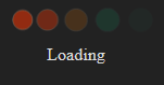
Which is achieved with following code:
<section id="d-splash">
  <template class="splash-svg-template">
    <svg
      xmlns="http://www.w3.org/2000/svg"
      xmlns:xlink="http://www.w3.org/1999/xlink"
      version="1.1"
    >
      <style>
        :root {
          --animation-state: paused;
        }

        /* user picked a theme where the "regular" scheme is dark */
        :root {
          --primary: #dddddd;
          --secondary: #222222;
          --tertiary: #15d1a0;
          --quaternary: #c14924;
          --highlight: #a87137;
          --success: #66ffcc;
        }

        /* these styles need to live here because the SVG has a different scope */
        .dots {
          animation-name: loader;
          animation-timing-function: ease-in-out;
          animation-duration: 3s;
          animation-iteration-count: infinite;
          animation-play-state: var(--animation-state);
          stroke: #fff;
          stroke-width: 0.5px;
          transform-origin: center;
          opacity: 0;
          r: max(1vw, 11px);
          cy: 50%;
          filter: saturate(2) opacity(0.85);
        }

        .dots:first-child {
          fill: var(--quaternary);
        }

        .dots:nth-child(2) {
          fill: var(--quaternary);
          animation-delay: 0.15s;
        }

        .dots:nth-child(3) {
          fill: var(--highlight);
          animation-delay: 0.3s;
        }

        .dots:nth-child(4) {
          fill: var(--tertiary);
          animation-delay: 0.45s;
        }

        .dots:nth-child(5) {
          fill: var(--tertiary);
          animation-delay: 0.6s;
        }

        @keyframes loader {
          0% {
            opacity: 0;
            transform: scale(1);
          }
          45% {
            opacity: 1;
            transform: scale(0.7);
          }
          65% {
            opacity: 1;
            transform: scale(0.7);
          }
          100% {
            opacity: 0;
            transform: scale(1);
          }
        }
      </style>

      <g class="container">
        <circle class="dots" cx="30vw" />
        <circle class="dots" cx="40vw" />
        <circle class="dots" cx="50vw" />
        <circle class="dots" cx="60vw" />
        <circle class="dots" cx="70vw" />
      </g>
    </svg>
  </template>

  <style>
    html {
      overflow-y: hidden !important;
    }

    /* user picked a theme where the "regular" scheme is dark */
    html {
      background-color: #222222;
    }

    #d-splash .preloader-text-wrapper {
      color: #dddddd;
    }

    #d-splash {
      display: grid;
      place-items: center;
      backface-visibility: hidden;
      position: absolute;
      left: 0;
      top: 0;
      width: 100%;
      z-index: 1001;
      --animation-state: paused;
    }

    #d-splash .preloader-image {
      max-width: 100%;
      height: 100vh;
    }

    #d-splash .preloader-text-wrapper {
      position: absolute;
      opacity: 0;
      animation: fade-in 0.5s ease-in-out;
      animation-delay: 1s;
      animation-fill-mode: forwards;
      animation-play-state: var(--animation-state);
      margin-bottom: -4em;
    }

    #d-splash .preloader-text:after {
      animation: loading-text 3s infinite;
      content: "";
      position: absolute;
      margin: 0 0.1em;
      left: 100%;
    }

    .rtl #d-splash .preloader-text:after {
      left: 0;
      right: 100%;
    }

    @keyframes fade-in {
      0% {
        opacity: 0;
      }
      100% {
        opacity: 1;
      }
    }

    @keyframes loading-text {
      0% {
        content: "";
      }
      25% {
        content: ".";
      }
      50% {
        content: "..";
      }
      75% {
        content: "...";
      }
    }
  </style>

  <img
    class="preloader-image"
    src="data:image/svg;base64,R0lGODlhAQABAIAAAAAAAP///yH5BAEAAAAALAAAAAABAAEAAAIBRAA7"
    alt="Checkmk Community"
  />

  <div class="preloader-text-wrapper">
    <div class="preloader-text">Loading</div>
  </div>

  <noscript>
    <style>
      html {
        overflow-y: revert !important;
      }

      #d-splash {
        display: none;
      }
    </style>
  </noscript>

  <script>const DELAY_TARGET=2e3,POLLING_INTERVAL=50,splashSvgTemplate=document.querySelector(".splash-svg-template"),splashTemplateClone=splashSvgTemplate.content.cloneNode(!0),svgElement=splashTemplateClone.querySelector("svg"),svgString=(new XMLSerializer).serializeToString(svgElement),encodedSvg=btoa(svgString),splashWrapper=document.querySelector("#d-splash"),splashImage=splashWrapper&&splashWrapper.querySelector(".preloader-image")
if(splashImage){splashImage.src=`data:image/svg+xml;base64,${encodedSvg}`
const e=(performance.timing.connectStart||0)+2e3
let s,a
const r=()=>{splashWrapper&&splashWrapper.style.setProperty("--animation-state","running"),svgElement&&svgElement.style.setProperty("--animation-state","running")
const e=(new XMLSerializer).serializeToString(svgElement),s=btoa(e)
splashImage.src=`data:image/svg+xml;base64,${s}`,performance.mark("discourse-splash-visible"),t()},t=()=>{clearInterval(s),s=null}
s=setInterval((()=>{a&&t(),Date.now()>e&&r()}),50),document.addEventListener("discourse-ready",(()=>{a=!0,splashWrapper&&splashWrapper.remove(),performance.mark("discourse-splash-removed")}),{once:!0})}
</script>

</section>
As an alternative I made a green hex shape following a hex path:

<style>
html {
  background-color: #222222;
}
svg {
  border: 0px solid #eee;
  display: block;
  margin: 1em auto;
}
p {
  color: #aaa;
  text-align: center;
  margin: 2em 0;
}
</style>
<svg width="120" height="120" viewBox="0 0 120 120">
  <path id="motionPath" fill="none" stroke="none" stroke-miterlimit="10" d="M50 0 L95 25 L95 75 L50 100 L5 75 L5 25 Z"/>

  <polygon id="circle" points="10,0 19,5 19,15 10,20 1,15 1,5" fill="#109d77" />

  <animateMotion
           href="#circle"
           dur="5s"
           begin="0s"
           fill="freeze"
           repeatCount="indefinite">
    <mpath href="#motionPath" />
  </animateMotion>
</svg>
To see it animate, save my code as html file and run it in your browser.
It’s not a complete and ready code replacement thingy, so it might need some more love and tweaking. But since I work just a few more days before my holiday till new year starts, thought I share it as it is now.
Consider it as my holiday bonus to you peeps.

 Looks cool and is a neat little addition.