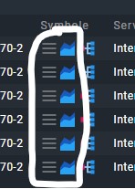
We’re using symbols to see at a glance which IT Service a host generally applies to (infrastructure, ERP, etc.) We’re showing them on our monitoring TV so we see immediately which service is affected. However the column “Symbols” always also shows the menu and graph symbol which are useless on that TV.
One way to do it:
Inspect the HTML, write a CSS rule to make the column disappear, save that in custom theme for monitoring TV user, or write it as a style for Stylus. Stylus is a client side css injector add on available for Chrome and Firefox.
Thanks for the hint. But how can I apply a custom theme for the monitoring user? I checked the docs and there you can only switch between light and dark themes.
This topic was automatically closed 365 days after the last reply. New replies are no longer allowed. Contact an admin if you think this should be re-opened.