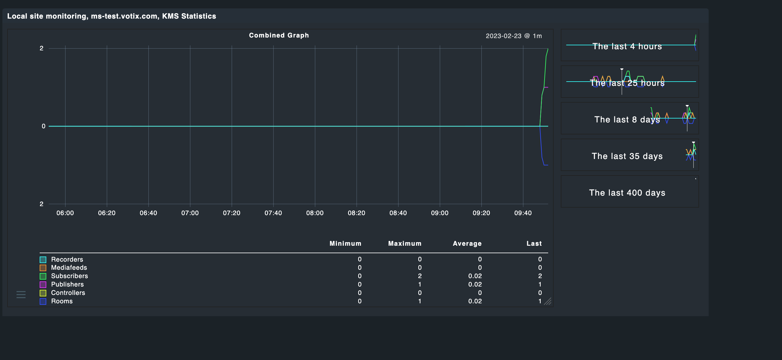
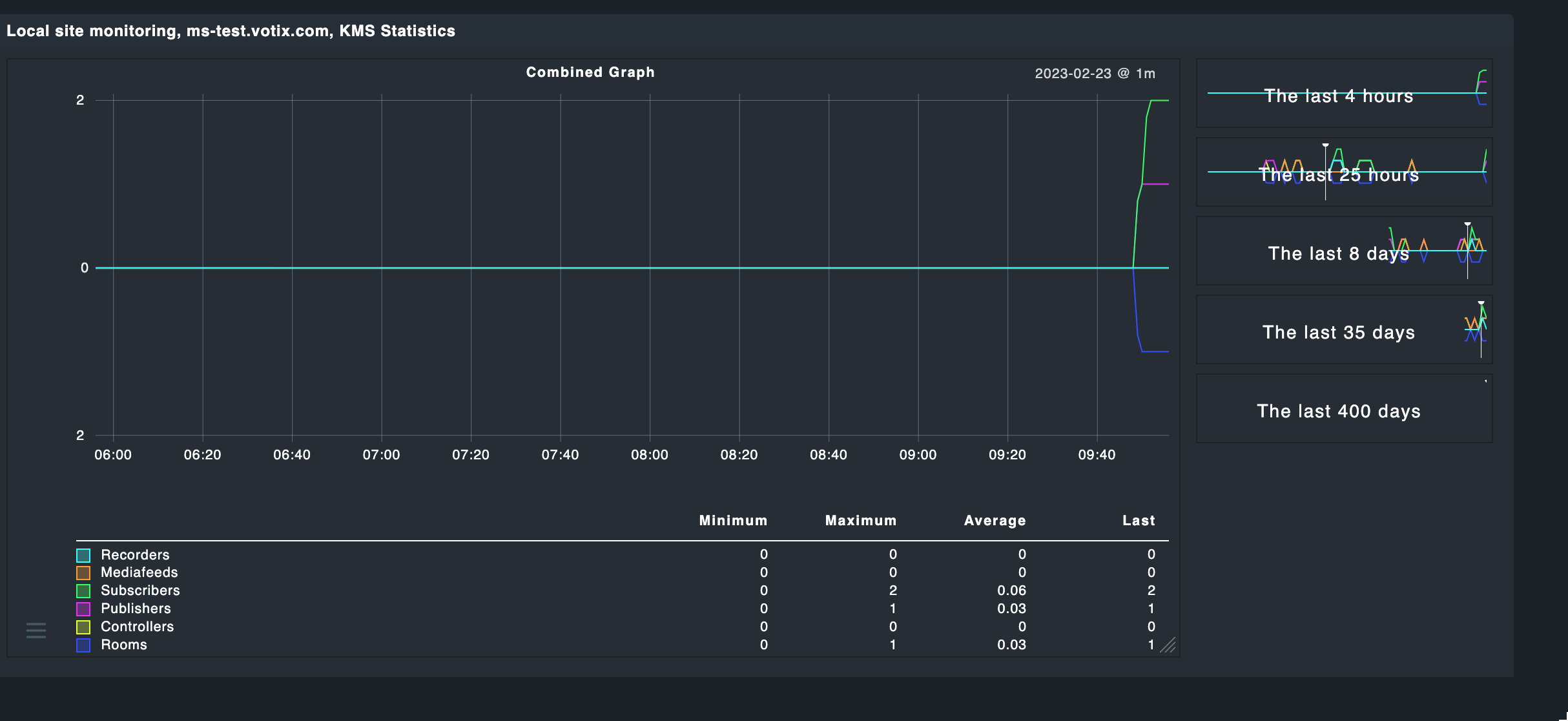
It is built from a combined display of 6 integers over time. I can’t really cope with “average” and “maximum” and stuff, since these values are just integers. Also - the round flanks of the graph don’t make any sense to me. Each value cannot be a float, that doesn’t make sense.
For instance: At around 18:04 the system encountered 1 for all counters, except “Recorders”. The graph looks like as if this appearance followed some mathematical function (what it didn’t). They all were 0 then 1 the 0 again.
I assume your graph is showing the average.
Instead I would try to show the maximum values.
You may use custom graphs but might be also possible in the graph definition.
Then I added a second subscriber. One minute later the graph told me, that I would have “1.8” subscribers running (sigh!). After two minutes (after the following update) it at least made more sense, but honestly…
Probably Last may be the better value.
Sorry I cannot help further with metric definition files. I just can browse through official code but have no time yet to play with it.
Looking forward to see your solution.
Thanks for your patience, but this doesn’t all change anything. I also found the mqtt metrics coming very close to what I have in mind, but I don’t have an mqtt server which I could observe.
This topic was automatically closed 365 days after the last reply. New replies are no longer allowed. Contact an admin if you think this should be re-opened.