Sometimes I really wonder what the thought process behind this design was.
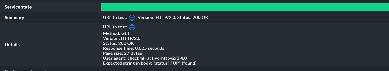
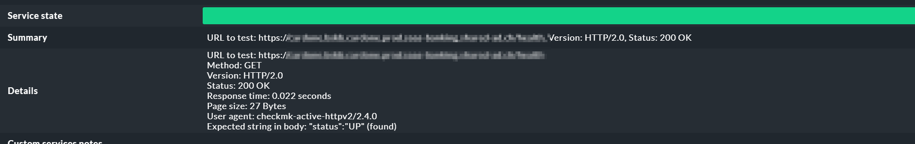
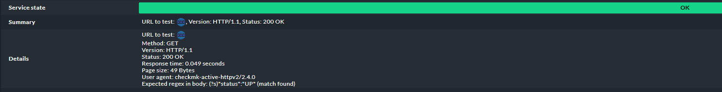
The details section of check_httpv2 is generally clear and well structured - except for the URL. Why is the checked URL hidden behind an unnecessary icon and only visible when you hover over it? In my opinion, the URL is the most important piece of information for the alert recipient, as it indicates which site is actually being checked and experiencing an issue.
And when “Follow the redirection” is enabled, why does the check once again display the final reached page behind that same icon, instead of showing both the originally requested URL and the one where the process eventually got stuck? After all, the most important piece of information for the alert recipient is the URL of the website being checked.

It makes no sense that the Summary and Details sections contain identical information without providing any added value. It’s a paradox: when everything is fine, plenty of information is displayed – but when a problem occurs, the presentation becomes minimalistic and hard to understand.
In today’s increasingly complex IT environment, it is important to present information in a clear, transparent, and comprehensible way. This ensures that alert recipients can quickly understand the situation and respond appropriately.
If the same alert message looked like this, it would be much clearer for everyone – even for those who are not familiar with the service:
URL to test:   https://my.domain.de/api/health
Redirected to: https://my.domain.de/oauth/authorize?response_type=code&....
Method:        GET
Version:       HTTP/1.1
Status:        302 Found
Error:         Connection refused by https://my.domain.de/oauth/authorize
It would be so easy to simplify life for alert recipients by presenting all relevant information clearly and in a single location. Displaying or storing the received output for later analysis would be extremely helpful, as issues often cannot be reproduced afterward and the business department frequently asks, “What was displayed on the page when the error occurred?”
I’m honestly frustrated with having to submit such obvious usability improvements through the ideas portal, only to watch them sit there for years without any visible progress or action being taken.