I’m not sure but in CMK 1.6 I had the feature called “combined graph”. If I used a filter for getting a list of the same services across multiple hosts then I could use a menu entry called “combined graphs” and then I got a graph from all the services in the list within one graph.
That was very useful because every user got a quick view of all the data in relation to the same services on the other hosts.
Now in 2.2 / 2.3 I can’t find that menu entry anymore.
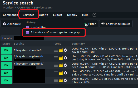
This is an image of cmk 2.2. What you are looking for is in the menu Services → All metrics of same type in one graph:
But one day I had a situation where this very menu item was missing, although my service search was very similar to other searches. Unfortunately it was not reproducible but maybe this is a bug in checkmk and you are currently facing it as well.
This is now the menu entry that @Dirk has shown you.
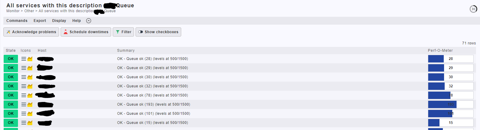
It is just not available in the “All services with this description” view. You have to use the service search view.
Ah ok, yes thats via service search now
I did’t see the topic Dirk.
In my opinion it’s now much more hidden then before. Why not showing this option directly in a service view to have quick access. Most of my users won’t make their way over the filter where they have to know the exact name of the service and so on…
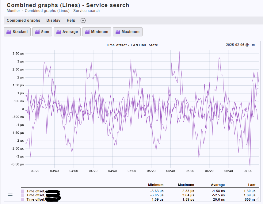
I know it has been a whil but… is it possible to change the color of the generated lines.
I normally want to see how the difference is between the same service across multiple hosts.
This topic was automatically closed 365 days after the last reply. New replies are no longer allowed. Contact an admin if you think this should be re-opened.