Hello,
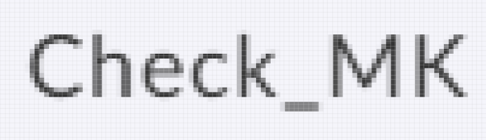
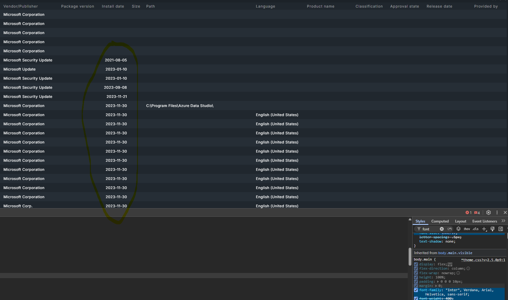
is there any reason for the font change? It looks smudged and the spacing/kerning uses more space for providing the same information:

Greetings
Stefan
Hello,
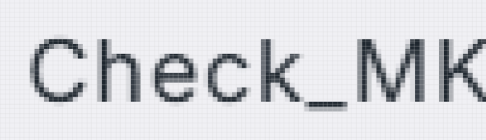
is there any reason for the font change? It looks smudged and the spacing/kerning uses more space for providing the same information:
Greetings
Stefan
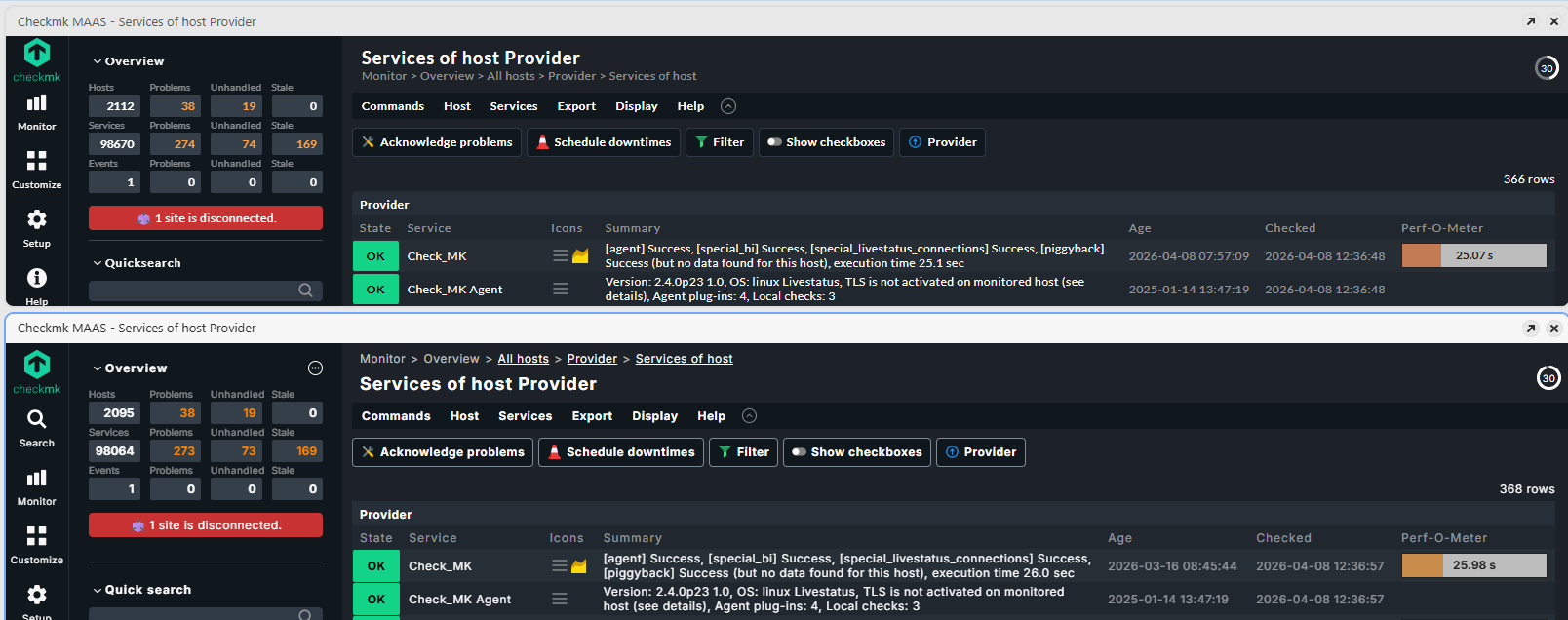
Nothing much to add here, just found it difficult to compare left to right in very low and very wide image, so I put them under each other. 2.5 is up, 2.4 is below.
What I notice is summary, age and checked columns have different widths. And with 2.5 indeed more anti-aliasing (less crisp), but also less bold and maybe 1 px lower?
If it looks good or bad depends on your used system/browser.
It is a different font family used that’s correct.
The explanation i think is fairly easy, 2.5 is loading the font and 2.4 relies on the font the browser is showing.
The size and the other parameters are the some only the font family differs as said.
Old: font-family: Lato, Roboto, Helvetica, Arial, sans-serif;
New: font-family: “Inter”, Verdana, Arial, Helvetica, sans-serif;
Font downloaded from CMK Site → /themes/facelift/fonts/inter/UcCo3FwrK3iLTcviYwY.woff2
Remember: The screenshot is side-by-side in the same browser!
I tested: Vivaldi, Firefox, Chrome, Edge, Safari. And the change is clearly visible in all browsers.
If i look a little bit closer i would say the new one provides a better contrast than the old one.
Old
I now have installed the fonts locally and I’m feeling it is getting worse (top: 2.4, bottom: 2.5):
I haven’t found any google-font-api-url. Initially the used font should have been “Helvetica” on my system. “Verdana” and “Arial” are in front of “Helvetica” now.
Old: font-family: Lato, Roboto, Helvetica, Arial, sans-serif;
New: font-family: “Inter”, Verdana, Arial, Helvetica, sans-serif;
Can you at least revert the order? Then I will remove the TTFs from my system and live with “Helvetica”. Otherwise it will be another task for ansible.builtin.replace …
The color contrast is “good” in 2.4 and “poor” in 2.5 (according to some color contrast/accessebility checkers). There are levels like “very good” and “super” above that…
The font is downloaded from your CMK server directly not from the net.
In theory the font files would be loaded and used for display, but if the url (fonts/lato-normal.woff) goes to nowhere, this is the result:
Hi @StefanM
thanks for the feedback. The font change to Inter in 2.5 was intentional - it aligns with our updated branding and Inter is specifically designed for screen readability and accessibility.
That said, we’ve taken note of your observations around crispness and are looking into whether there’s anything on our end (font-weight bundling, anti-aliasing settings, etc.) that could be contributing to a softer appearance in certain environments.
From what we’ve seen so far, the difference is fairly subtle on most setups, but we know rendering can vary quite a bit depending on OS, browser, and display, so we definitely want to make sure it looks as good as possible across the board.
We’ll report back if we find anything actionable. In the meantime, if you have specific browser/OS/display combinations where it looks particularly off, that would be helpful to know.
Cheers
Tanja
@theyken Thanks for your answer. At the moment I’m trying to figure out how the font is loaded. I haven’t found anything in the source of Checkmk and the delivered pages. But when I install the TTF on Windows/Linux the appearence of the fonts change. I think the primary change is the order of the fonts. Helvetica was my previous first match. Now Verdana is chosen. When I install the fonts the results are becoming less different, but the contrast is not good in some places (e.g. the orange in the Sidebar→Overview)
It seems installing the TTF is changing the font fallback order, which is why Verdana is now being used instead of Helvetica. This is also affecting the UI contrast in some areas.
So! We have found out that chrome font rendering on unix struggles with variable font sizes. We are currently working on shipping static-weighted files that should fix this. A similiar issue was actually raised in the Inter github. Will update you once we know more 
Thanks for your patience!
Cheers
Tanja
I will also add that I am not a fan of the new font or the way it is rendered. These screenshots were all taken on Google Chrome 149.0.7827.155 on Windows 11. Using 2.5.0p7 and 2.4.0p32 for testing.
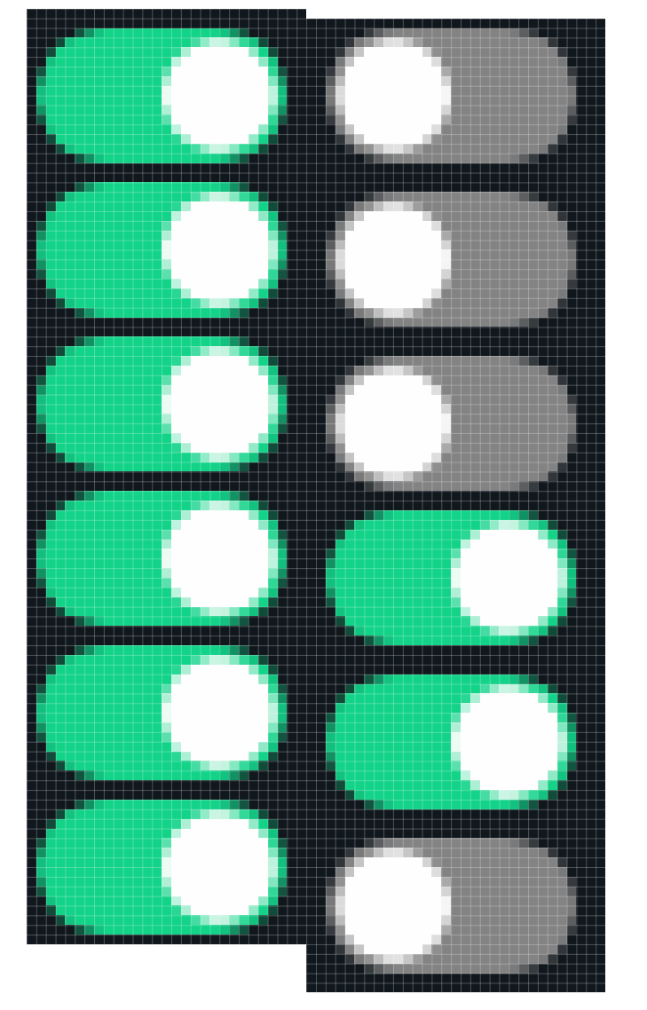
A good example is the “Master control” section. With 2.4 there is a consistent 2 pixel gap between each toggle on 2.5 most are 3 pixel but one is 2.
On the left is 2.4 and the right is 2.5. Perhaps I am being overly pedantic but at least to my eye the left looks way better, even when not zoomed in to the pixel level.
Checking the computed style for 2.5 shows:
Family name: Inter
PostScript name: Inter-Regular
Font origin: Network resource(21 glyphs)
and 2.4 shows:
Family name: Arial
PostScript name: ArialMT
Font origin: Local file(8 glyphs)
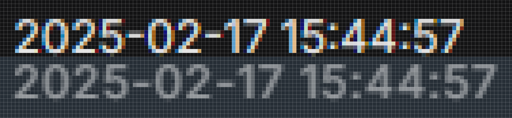
Changing the css to set font-size: 11.5px; and letter-spacing: .01px; got it closer to the same information density as 2.4.
Top is with .01px and bottom is with the default of .5px.
This guy uses letter-spacing of 0, but his goal was to match the spacing of the San Francisco font.