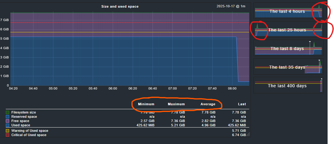
[/dev/mapper/sysvg-psi–coreslv], Used: 68.78% - 5.35 GiB of 7.78 GiB (warn/crit at 73.45%/86.72% used), trend per 5 days 0 hours: +14.1 GiB (warn/crit at +5.00 GiB/+8.00 GiB)CRIT , trend per 5 days 0 hours: +181.36%, Time left until disk full: 20 hours 39 minutes (warn/crit below 1 day 0 hours/12 hours 0 minutes)WARN
Question 1:
trend per 5 days 0 hours: +14.1 GiB
why +14 GB, the last 5 days the used space changed from 425MB to 5,35GB - thats not +14GiB.
trend per 5 days 0 hours: +181.36%
+181% Why? How?
Question 2:
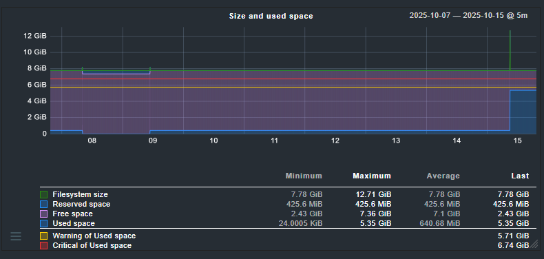
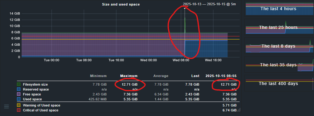
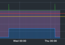
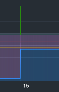
Whyt is that spike and why did it vanish as soon as I zoom in.
The spike is gone, the new max at the picker is suddenly 7.78GB - I didn’t move the picker.
Zooming more in doesn’t bring the spike back. I don’t think someone just changed the filesystem size in that time.
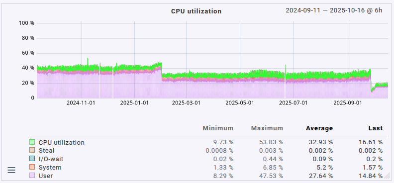
I can only give an answer to the second question, the spike. The way performance data is displayed is that when you zoom out/view larger time frames you’ll see aggregated data: either minimum, maximum or avergage. The default is the maximum.
One of the effects is in the maximum aggregation you start seeing some rather high values from time to time around moments when the data actually changes. For a lot of types of data it’s actually better to view the average (maximum is the default display mode for the graphs). In order to switch to minimum/maximum/average you have to click on the corresponding table headers below the graph. It’s not really obvious to see that those are actually links.
Please note that those headers are only links if your actual view does actually aggregated data. If you’re on the highest zoom level (“last 4 hours” for example) they won’t be links as each pixel column is not aggregated.
Furthermore the data storage (RRDs) aggregate older values anyway. Please see the “Configuration of RRD databases of hosts” rules, but also this article with a lot of in-depth information about how RRDs work.
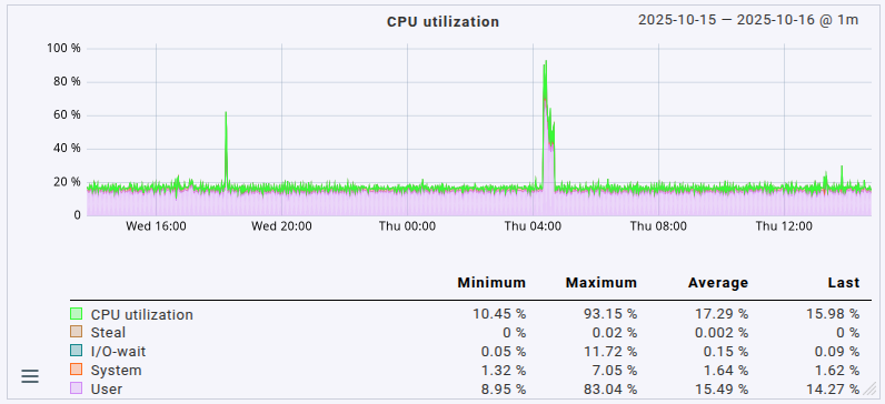
I’m aware that data is aggregated, especially over longer time ranges like 300 days. However, I’ve never experienced spikes disappearing when zooming into the “Last 25 hours” graph.
The spike occurred about 5 hours ago. According to the RRD configuration: “The default is to keep one-minute precision for the first 2880 minutes (48 hours)”, I believe this is not an effect of RRD compression or aggregation.
What’s fascinating is that these spikes always seem to appear when data is written or deleted, and they match the amount of data involved.
I did some tests: with SLES12 SP5, the spike did not appear (tested with CMK 2.3 and CMK 2.4).
With SLES15 SP5, however, the spike does appear.
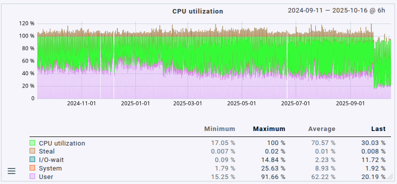
Just looking at that higher timeframe you’d think the server was way more loaded than it actually is. This is due to the default aggregation used, the “maximum” method. If I switch over to the “average” method things look much more reasonable for the utilization I actually see in use on the machine:
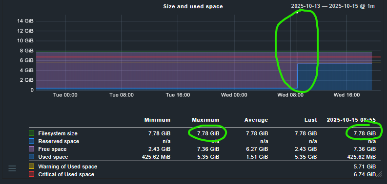
I totally understand that. I just have one issue: the 4h and 25h graphs don’t use aggregation in the default RRD configuration. So, all the data should be displayed, right? The spike should be visible.
In these two graphs, you can’t switch between min/max/average because there’s no aggregation — all those “hidden” links are disabled.
So, the spike appears in the preview on the right side, but not in the main graph. If I zoom out and aggregation kicks in (i.e., for >25h), the spike is suddenly there.
That’s what I don’t understand. The first two default time ranges (4h/25h) should show all the raw data, but they don’t. And then, as soon as aggregation starts (>25h), the spike appears. Maybe I’m just not smart enough
The other thing — the calculation of the trend — is even more confusing to me.
Yeah, you’re right that the 4h & 25h zoom levels aren’t aggregated. But the overview graphics (the backgrounds on the timeframe buttons on the right side) certainly are, in some way, 'cause there are certainly more samples than the graphics are wide (in pixels). Therefore, aggregation, and my guess is: the main view’s currently selected aggregation or maximum if there’s no aggregation selected in the main view.
You’re correct that there’s no aggregation in the main view if the three column headers aren’t links.
I don’t, sorry. I intentionally only wrote about the graphs as that’s something I spent time looking into, but I haven’t used or looked into calculations a lot yet.