We compared our old pdf-report generating tool and the checkmk reporting function.
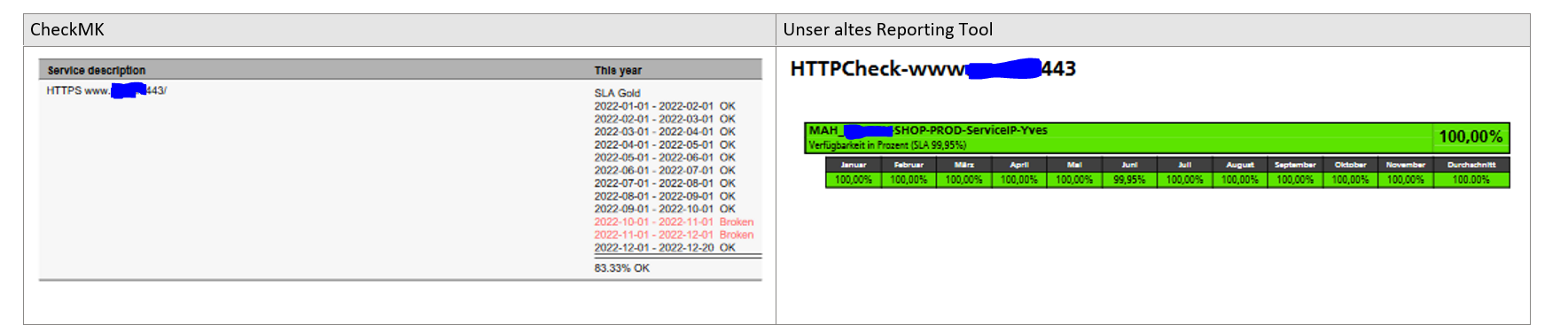
We wish a monthly percentage view (instead of just “broken”) and a better presentation of the data, for example: too much space wasted below the service description. A view in rows, instead of columns, like in our old tool would be nice.
The reporting feels sadly “slightly” abandoned - we also would love to have it refreshed and made state of the art.
Especially for presentation in many ways (just compare the graphs with the GUI and the report) - even more if you have to send/present it to your customer or manager
My suggestion, open a feature reqeust (one for every point ) and vote for those which are already there
This topic was automatically closed 365 days after the last reply. New replies are no longer allowed. Contact an admin if you think this should be re-opened.