Hi everyone,
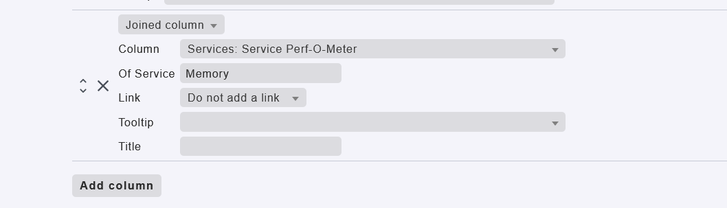
I have to create an view at work which displays the RAM usage of a group of hosts over the last year. Now I have a view which shows me all the graphs of the service “memory” (column 1 hostname, comuln 2 service) which, depending on the hosts operating system, consists of 3 graph for windows hosts and 17(!) graphs for linux hosts.
For the sake of readability I only want tho show the “RAM used” graph with the absolute amount of used memory (in GB) from the windows hosts and the “RAM + Swap overview” from linux hosts.
I cannot find any method to selection of the graph within the service column of the view.
I also thought about creating a graph collection. From the hosts overview I can go to memory and then select “Add to graph collection” from the burger menu next to the graph I want and it shows up in the respective collection. But for >70 Systems this would be quite a lot of clicking to do. I haven’t found a way to easily select a range of hosts to show the respective graph from.
SInce ChackMK is for monitoring great many systems and should me able to easily create overview like this I guess I am just on the wrong track.
Has anyone any suggestions?
Thank you in advance!
Best regards,
Marco