Here i found an Service graph combined with a timeline,
i like this very much:
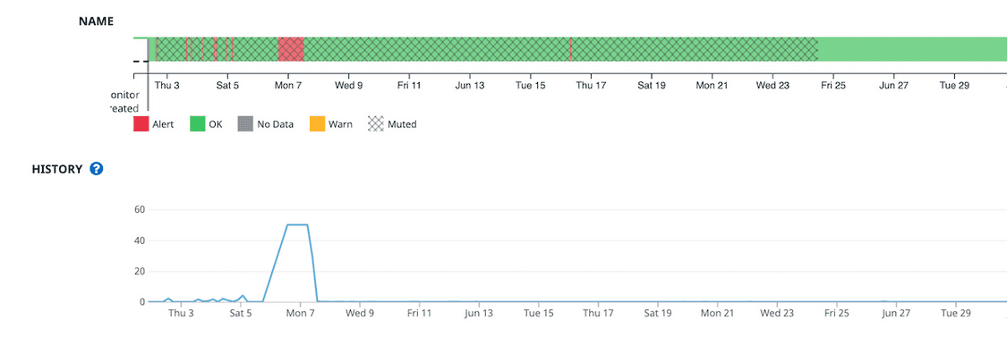
It is easy to understand what happened, when the service reached the threshold,
and when the service was in downtime.
I would love to see this in checkmk as well.
I have not idea from what tool this is comming from, perhaps zabbix or datadog ?