Greetings community,
The results are in!
First and foremost: Thank you so much for taking part in this survey!
It is really interesting to get a glimpse of what the average user interface looks like for you.
Here is what we learned:
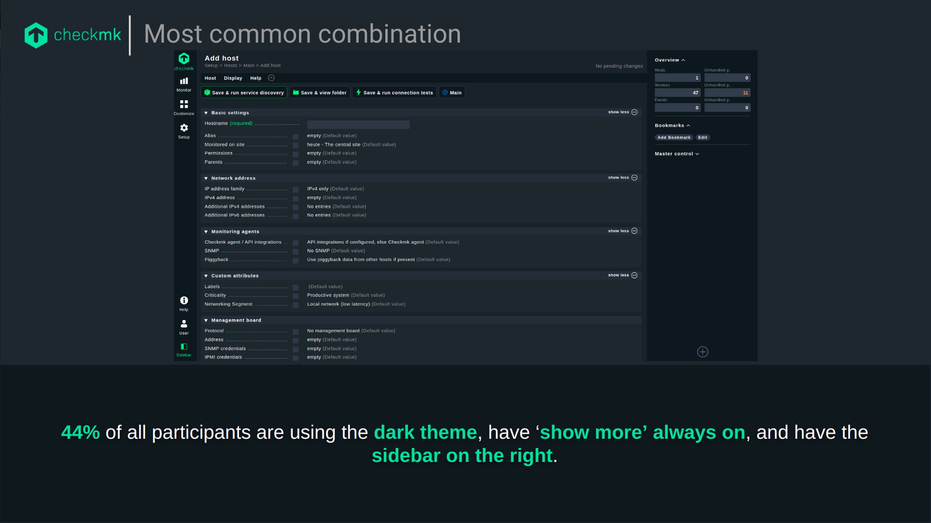
- 84% use the dark theme
- 61% use the icons per topic (green) while 39% use the colored icons per entry (pretty close!)
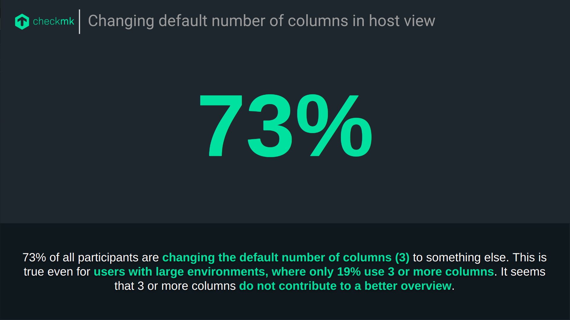
- 73% change the number of columns in the host view from 3 to either 1 (52%), 2 (18%) or more than 3 (3%).
- 75% have ‘Show more’ always enabled, only 4% have ‘Show more’ never enabled
- 55% have the sidebar on the right, but of those who choose the light theme, 71% have the sidebar on the left.
- All participants use Checkmk on their desktop and 15% use it on their mobile phone.
We are using these results as a starting point for further research, particularly into the use of Checkmk on mobile devices, the usability of the ‘show more’ pattern and the benefits of icons per topic/entry.
We are also currently evaluating the impact of changing the default number of columns in host views from 3 to 1.
Thank you all for taking part and giving us an interesting insight into your Checkmk site!