The end of the month has arrived, which can only mean one thing: it is time for the next Micro survey! This is the sixth one, and it is all about what your Checkmk site looks like.
Because: One of the greatest things about Checkmk is that you can customize your site to make it your Checkmk. So start the 6th Micro Survey and tell us all about your theme, icons, sidebar… We are looking forward to your feedback
In the last Micro survey we explored what host actions you are using in the host setup and how often. This helped us to further refine the order of the host action icons in the setup. Read all about it here.
The 6th Micro Survey is now closed. We appreciate everyone who took the time to share their thoughts and insights on the use of Checkmk. Thank you for your valuable input and stay tuned for updates on our progress!
The results are in!
First and foremost: Thank you so much for taking part in this survey!
It is really interesting to get a glimpse of what the average user interface looks like for you.
Here is what we learned:
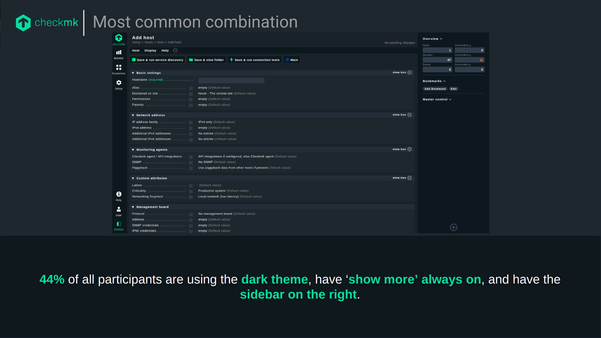
84% use the dark theme
61% use the icons per topic (green) while 39% use the colored icons per entry (pretty close!)
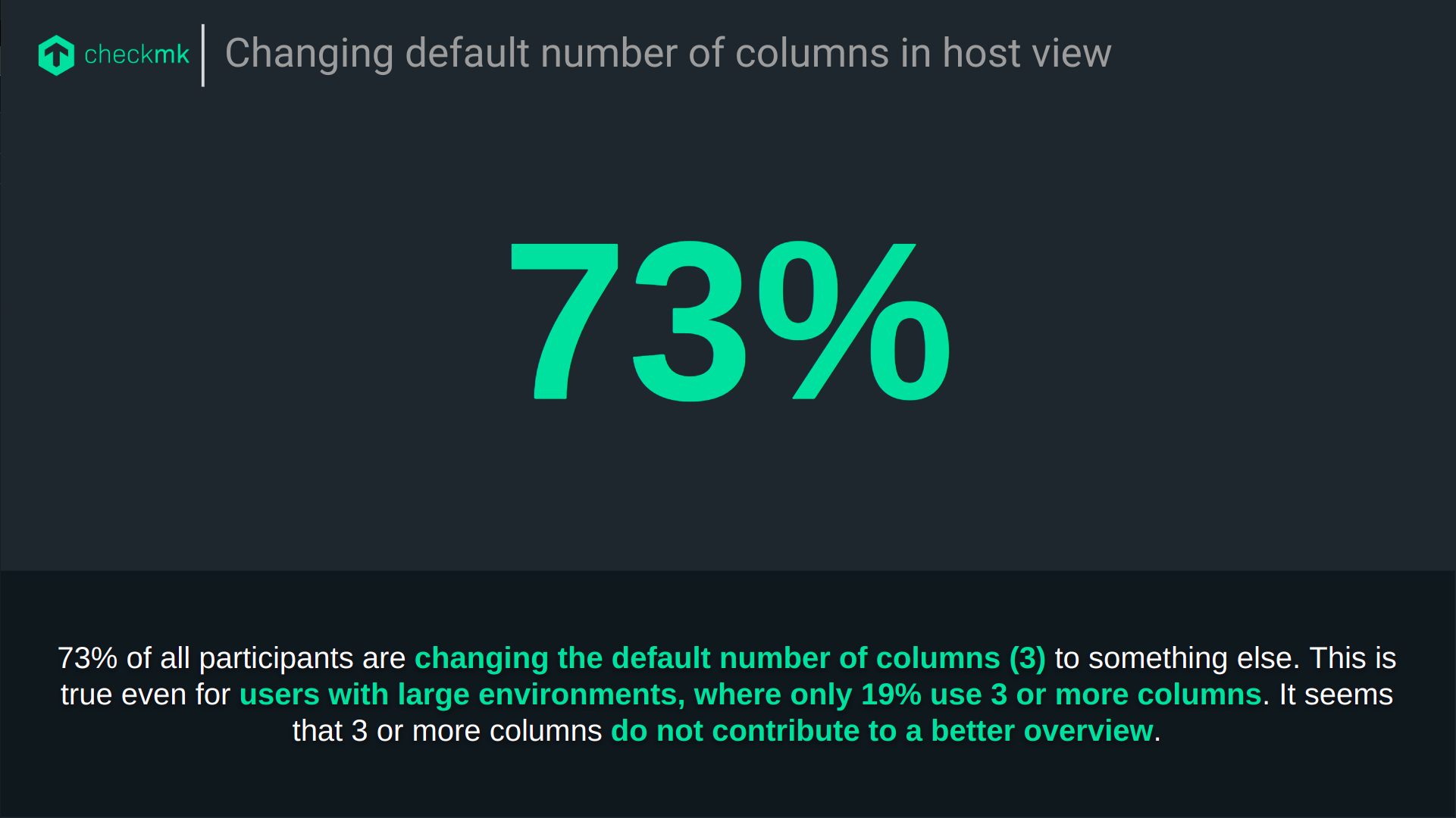
73% change the number of columns in the host view from 3 to either 1 (52%), 2 (18%) or more than 3 (3%).
75% have ‘Show more’ always enabled, only 4% have ‘Show more’ never enabled
55% have the sidebar on the right, but of those who choose the light theme, 71% have the sidebar on the left.
All participants use Checkmk on their desktop and 15% use it on their mobile phone.
We are using these results as a starting point for further research, particularly into the use of Checkmk on mobile devices, the usability of the ‘show more’ pattern and the benefits of icons per topic/entry.
We are also currently evaluating the impact of changing the default number of columns in host views from 3 to 1.
Thank you all for taking part and giving us an interesting insight into your Checkmk site!
I would have thought that more people have their sidebar on the left.
But I can say +1 for reducing the default column amount to 1. That’s one of the things that I always have to do.
Another feedback is that the light mode is in my opinion too light, in 1.5 and 1.6 there was more contrast in general. The Sidebar was dark, and the rest was light. Nowadays, everything is light in the light mode. But in the end: Dark mode for life!
Thanks for the feedback! I totally feel you, this is me, when accidentally clicking on the theme switch:
Joking aside, there are currently no plans to make major improvements to the light theme or to introduce a third theme. That’s why I suggest you create a feature request. Especially for me, it is really important to keep track of the UX related requests and if it gets enough votes, we can bump it up on the roadmap.
Feel free to link to the feature request in this thread - I am sure others feel the same way
Good news everyone:
Based on the survey results, we have implemented the change of the default number of columns in host views from 3 to 1! This change will be available with Checkmk 2.3. If you have already customized the number of columns, this will not change anything for you!