Thanks, @theyken, for the results.
I would have thought that more people have their sidebar on the left. ![]()
But I can say +1 for reducing the default column amount to 1. That’s one of the things that I always have to do. ![]()
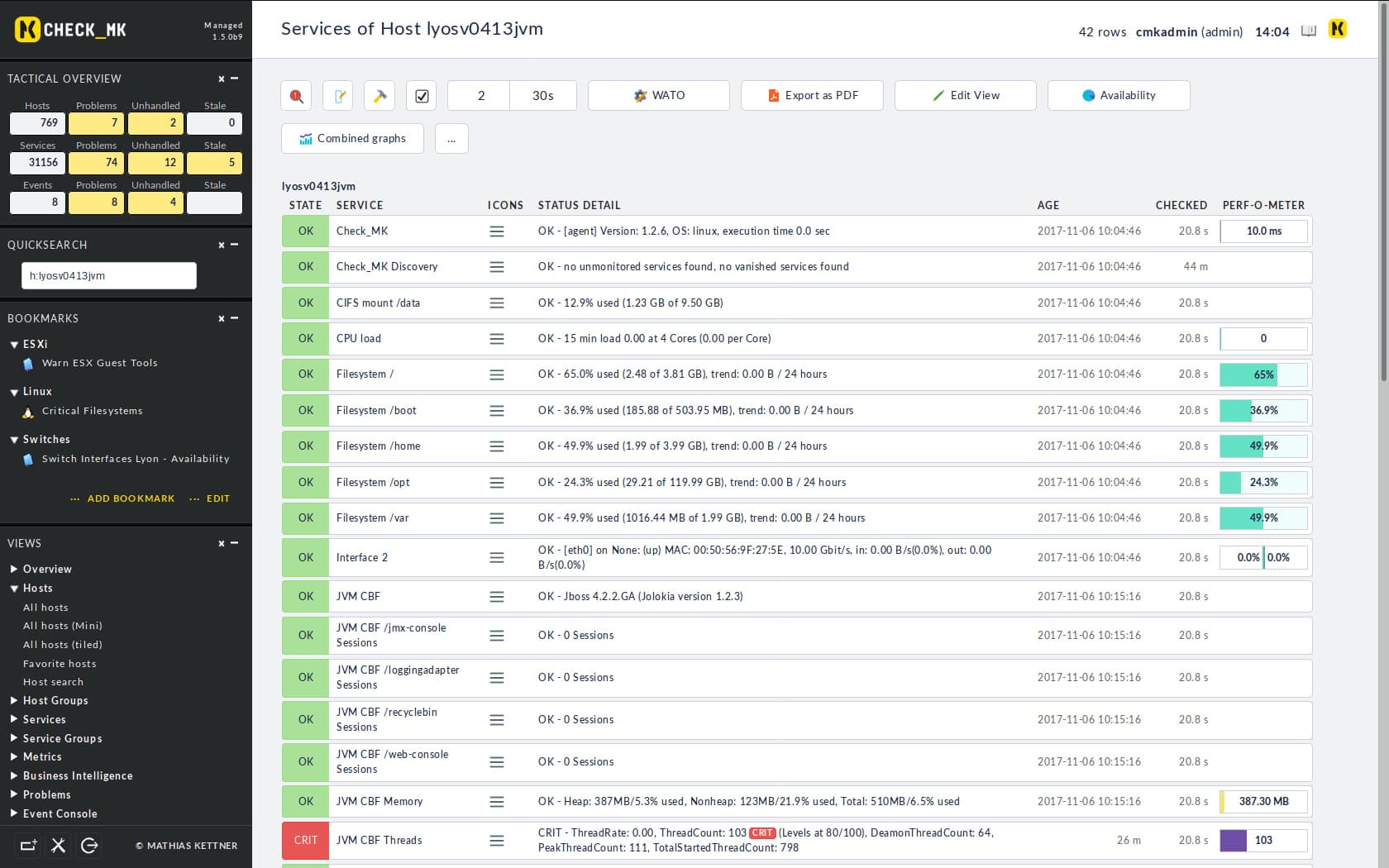
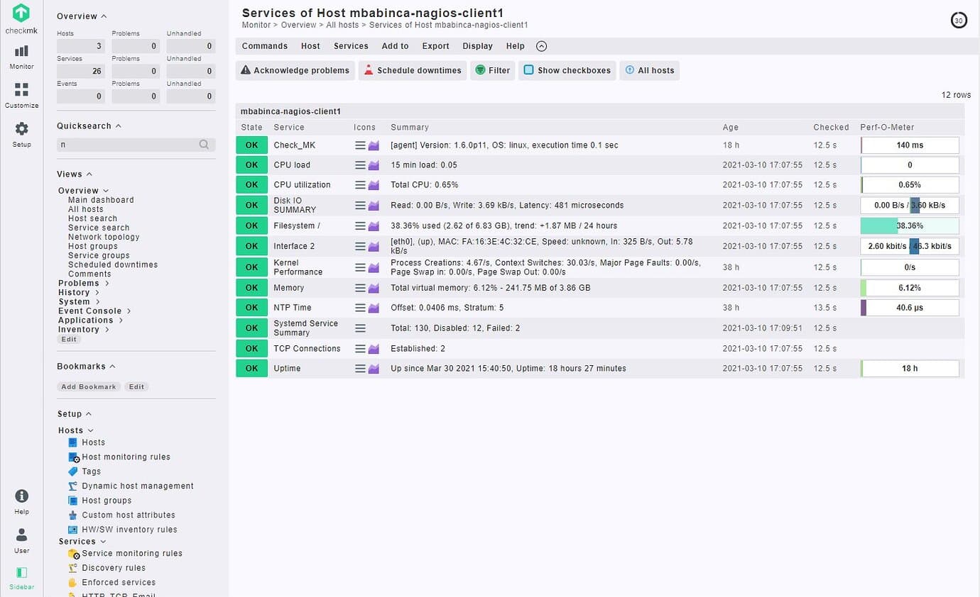
Another feedback is that the light mode is in my opinion too light, in 1.5 and 1.6 there was more contrast in general. The Sidebar was dark, and the rest was light. Nowadays, everything is light in the light mode. But in the end: Dark mode for life! ![]()
Lightmode in 1.5 / 1.6:
Light mode nowadays:
People suggested this in the forum already: Check_MK 2.0 mixed light dark theme
Regards
Norm