Hello,
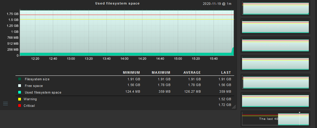
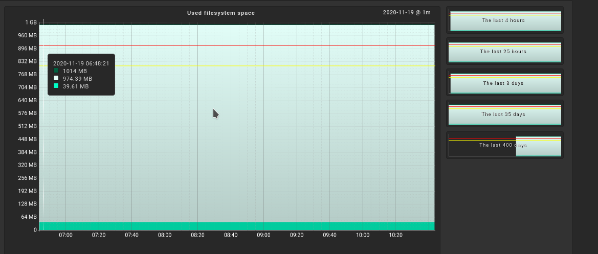
I have a question about the graphs. On the right side you can select the time frame of the graph. But it seems that there is a conflict with the colors? Normally it says “Last 4 hours” and so on. But you can’t read that anymore. Is that a bug? Has it been addressed somewhere /somehow?
Hello,
thanks for the feedback. Since this is still the case in 2.0, I sent it to the feedback address as a suggestion for improvement. It’s also funny that the other graphs, e.g. Load, use a black background… you can read everything better. But for the filesystem graphs the background is still white?!