Hi,
I am Thomas, product manager here at tribe29. I recently saw a post (button positions) about UI inconsistencies and a request to improve them. As many of you are day-to-day users of Checkmk, I wanted to ask if you have more examples of an inconsistent UI or for page designs which could be improved for easier use. If you have, would you mind sharing them here as a reply. I will review your comments and see, which can be fixed in the V2.1 (or later)
Note: This request is about fixing the existing UI and not about cool UI features you want us to implement. Send those in a different post. Thanks, Thomas
1 Like
Color values in reports.
Why do I have to enter RGB values in percent when designing a report?
A color picker (like the one from the custom graph designer) would be very useful here. Or at least the usual hexa-decimal input like everywhere else.
This comment was made just after I trained that topic today 
6 Likes
By default, all users the the new main dashboard with the “Total host problems” and “Total service problems” dashlets - however, in a lot of setups, not all users have permissions to see the checkmk host itself, and hence also cannot fill these dashlets with values and simply get an almost empty dashboard.
I understood that saving the historical number of errors for every possible role/permission/contact group combination is impossible given the current data model, but maybe replace the dashlets with something that works globally?
3 Likes
I’ll go on with little things:
when adding additional filters in the filter sidebar, the list of possible filters is very long (which is good!), but it’s difficult to find what you are looking for, I always resort to using the browser builtin text search, but that finds matches on the whole site, a little filter as you type (similar to all drop down menus since 1.6) would be very nice!
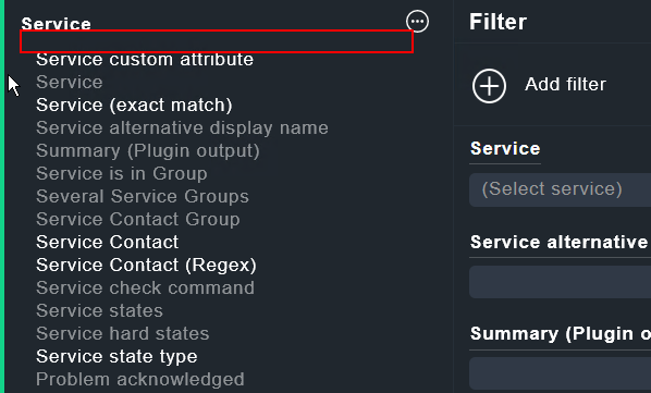
maybe somewhere here.
6 Likes
Understandable comment. Lets see, if this can get fixed
1 Like
This will require some thinking and research. Because depending on the permission given by the system, almost every dashboard we build might fail to show something valid
Interesting suggestion. Is this a feature, others would value as well?
5 Likes
Hi,
When you add the snap-in “Tree of folders” the first time (for a user), you get only one dropdown menu. Only after you change the value of the dropdown, you get the right view with 2 dropdowns. (Where you can choose between Main Dashboard, All Hosts etc.)
Cheers Jeronimo
4 Likes
Hi Jeronimo,
thank you for your feedback. This sounds more like a bug. I will have the developers check for the root cause
Thomas
This might be something, that is heavily dependent on opinion…
Nonetheless: When computing availabilities, there are two items in the Availability → Options sub-menu. One is “Change display options” the other is “Change computation options”.
The setting for “Time Range” currently resides in “Change display options”. Personally, I would expect this in “Change computation options”, though. Since in my opinion “Time Range” changes the scope for the data valid for computation, this would make more sense to me.
As of now, we have to configure availability settings in computations options, apply them, and then update the time range in display options. I find this a little confusing. This might just be me, though 
3 Likes
I am also not quite happy with separating the options in two menus.
1 Like
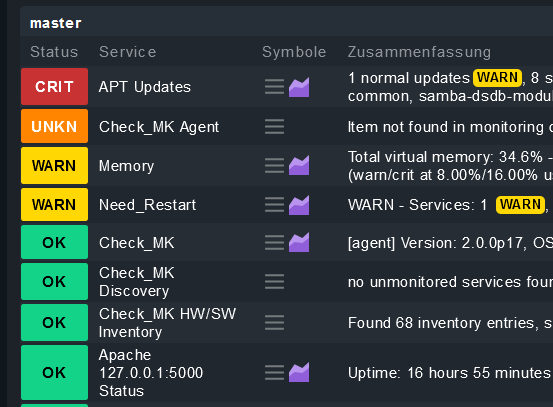
I would like to have the default sort order in the Services of Host view changed from Service to State (Sorted by Crit/Warn/Unkown/Stale/Ok), so i have the problematic services on top and do not need to scroll down. Maybe Check_MK, Check_MK Discovery and Check_MK HW/SW Inventory should stay on top like now.
1 Like
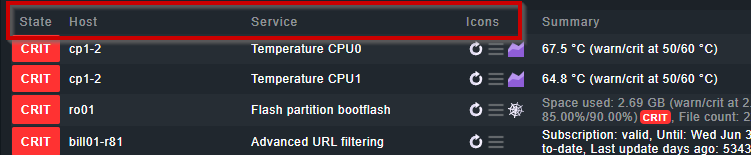
The second thing i would change in the Service of Host View (and in all other views where you have State and Icons), put Icons in the second column. By this the will stay more ore less on the same place regardless of the service name.
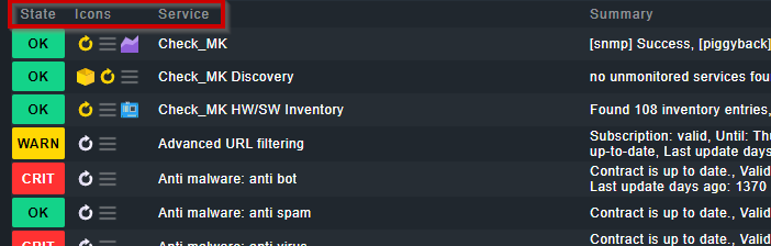
versus
5 Likes
Switch the default for the Sidebar from Right to Left. I know i can change this easily in the User settings, but in my opinion it is not logicaly to hide/show something on the left side of the screen only to move over to the other side of the screen to use it…
3 Likes
Hi thl-cmk,
I understand the logic behind your request. But we also thought about this. The reason we put it right as default is, that the menu does not overlap with it. As this is easily changeable and a 2 click action, I hope you are fine with the current position
T.
How do others feel about this? I can understand the logic. On the other side, I want to have the service name right next to the state
Hi thl-cmk,
like this?
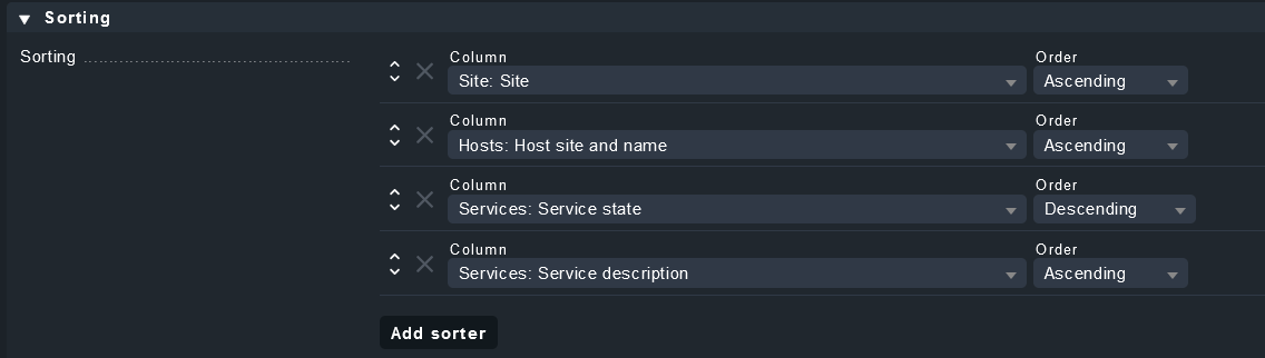
Why don’t you modify the view via Display > Customize View? It allows such customizations
T.
1 Like
I can, but I think
that the menu does not overlap with it
is not valid, because I will not use the Sidebar and the Menue at the same time, so this overlap is no issue.
Why don’t you modify the view via Display > Customize View? It allows such customizations
I know I can do this, but this was about what you can do better, and save me some klicks. And evenen if I do this, it will not sort in the way I want it Pined services → Critical → Warning → Unknown → Stale → OK